To conclude on this entire year is a difficult thing to do considering all the ups and downs I’ve experienced. But I can safely say how it has done nothing but make me more passionate about my practise - through my developed professional personality and approach to briefs with various clients and collaborators, to the endless hours spent experimenting with tiny little changes in After Effects, it has all helped to sculpt who I am as a designer now and the ventures I will make in the future.
At the start of the year, I initially stated how I wanted to really experiment with my design style through my evolving acquired focus of motion and digital illustration. I can confirm how this was a firm success, as through my practise and engagement with the industry I have done nothing but consider how I can incorporate and further develop my skills in both, whilst ensuring the end product is appropriate and relevant to the brief and or client. By finding my focus quite early on, I think I have been able to succinctly evidence this development throughout all of my briefs, really pushing my engagement with design for screen and how I can approach the digital audience in a punchy, concise, engaging and interactive way which is professional yet considered.
Through carrying out in-depth research to better develop my understanding of the digital social platforms, I think I have been able to really reflect this within my practise and go on to building a striking and relevant collection of work for my portfolio to represent myself as the confident, professional yet fun designer I am.
I hope I can continue to push this focus of designing for a digital audience after university too - allowing me to think in more of a broad sense and consider how I could thoroughly enjoy a more flexible role as a brand social media consultant, solely specialising in the engagement of the audience through social media via interactive and moving content.
In terms of my time management this year I have rigorously improved. As I have naturally been more engaged with the work I am completing and had this passion and drive to develop my own practise, therefore it has felt much more manageable considering the stress of final year uni. I can honestly say how at the beginning of the year I was greatly under-estimating the render times through my interactive moving content, but I felt that as I became more experienced and comfortable with the After Effects software I was able to naturally evolve past this hurdle.
Through the variety of collaborative and live commissioned briefs I have worked on with clients it has pushed me and my communication skills massively - allowing me to be considerate and appropriate with my approaches to various clients and collaborators dependent on their personality, background and style. I was especially put to the test through the Ferguson project where I had to actively follow up on him to ensure I was getting the necessary information and confirmations I needed to evolve the project forward. Although not all bad, it also gave me a proper opportunity to take control of a brief and art direct through the commissioning of an external photographer too. Here I was able to exercise my directing skills, and specifically tailor each element of the composition to ensure I was getting the desired angles and moods to get the best results - to then go back and work digitally with. Although pressed for time in this particular project in the end it was a great success and I got good feedback from the photographer and the client, suggesting I took control of the shoot well and directed the subject and the photographer in a concise and clear manor which enabled me to then go onto developing the desired output to a professional level.
Although some briefs, were more difficult than others, I did enjoy all of them as I feel they have each developed me in different ways. Through working on briefs that had a strict deadline or time frame to complete the work within, it gave me a solid taste of what working quickly and efficiently to meet the clients expectations is like, readying me for after university in many ways. Examples of these briefs include the Intern commission and Secret 7, where I had to work under quite a lot of pressure on top of a busy schedule to ensure my output was ready in time yet up to an accepted standard. In both cases, I lived up to the expectations and produced both striking and thought-provoking responses. Especially through the Intern project were I was lucky enough to see my work at this huge scale infront of a room full of creative people. This was definitely a milestone for me as a designer, and I think it is safe to say it has done nothing but drive me further into the industry as well as giving me more confidence and passion within my practise.
Overall, I feel very well equipped to graduate into industry after my time at LUA. And within the course I have been able to develop an intriguing and hopeful plan for afterwards, whilst still giving me the opportunity to experiment with different directions if I so choose.

Studio Practice
Sunday, 13 May 2018
603 - Brief 07 - Evaluation
I surprisingly thoroughly enjoyed my research project for the 603 submission this year - going into great depths surrounding the skateboarding industry and how it has essentially grown into a consumer culture and heavy-weight industry today. Starting as a small, niche market I found it profoundly interesting finding out about how various competitions caught the public eye over the years and how big names such as Nike influenced the growth of the industry, especially in the past 10-15 years with the introduction of the web and various social media platforms. This has allowed for skaters to essentially create their own interactive content for the fans to become engaged with, so they not only have to rely on the occasional big skate video or feature in a magazine to get their name in the lime-light and earn a living. But now with the advancements of the social platform they can engage with fans in their every day life.
Not to mention, how this too has obviously impacted the direction and approach of the big brands and how they engage with those younger audiences - using the social platforms as this immediate and round-the-clock medium of engagement and interaction of their content.
I developed the focus of my research onto Nike in particular, considering how their various campaigns and adaption into the Skateboarding community has done nothing but expand the audience. Through the creation of non-intended Skate shoes which naturally caught on within the community, to then how they directed trainers directly to this community, then considering how these naturally became worn as more of a fashion statement in everyday life by people outside of the Skate community.
To effectively summarise this research I drew everything together and decided to produce a brief social media campaign aiming to celebrate the history of Nike Skateboarding whilst continuing to push them into this new realm and style of trendy digital advertising and I think my outcomes clearly do just that.
I initially suggested how I did need to consider all research conducted to this point on Nike SB as a brand and its developing approach to its advertising campaigns, whilst also considering how I can carry this forward and create something new and engaging for the community - inspired by the new glitchy / remixed styles of today, as well as still reflecting on its diverse past. I think I have successfully fulfilled these initial guidelines through an appropriate design style which is relevant to this current state of the industry. My feedback has suggested to me how I have created this short but punchy ad, which is in your face and catches the eye of the audience - especially appropriate for when scrolling through the social media platforms being so hard-hitting and easily recognisable of Nike. This is done through the colour scheme, design style and typeface used - all being trendy and reflective of the up and coming youth of today which is the primary audience of the skateboarding community. Not to mention, how the music does nothing but compliment the overall design and reflect this young and quite urban audience.
I initially suggested how I did need to consider all research conducted to this point on Nike SB as a brand and its developing approach to its advertising campaigns, whilst also considering how I can carry this forward and create something new and engaging for the community - inspired by the new glitchy / remixed styles of today, as well as still reflecting on its diverse past. I think I have successfully fulfilled these initial guidelines through an appropriate design style which is relevant to this current state of the industry. My feedback has suggested to me how I have created this short but punchy ad, which is in your face and catches the eye of the audience - especially appropriate for when scrolling through the social media platforms being so hard-hitting and easily recognisable of Nike. This is done through the colour scheme, design style and typeface used - all being trendy and reflective of the up and coming youth of today which is the primary audience of the skateboarding community. Not to mention, how the music does nothing but compliment the overall design and reflect this young and quite urban audience.
In terms, of time management I think I handled this project well - I did leave it as my final project to produce the outcomes for but this effectively taught me how to develop a project concisely yet thoroughly when working to a deadline. In terms of carrying this into the future / if I had more time on the project I would definitely begin going back into the overlaid animation style which worked over the top of the video content - I found this very fun to experiment with and would definitely want to see how I could develop my frame-by-frame consideration. Maybe even pushing it into more traditional stop-motion territory, making it much more hands on and practical.
603 - Brief 07 - Production
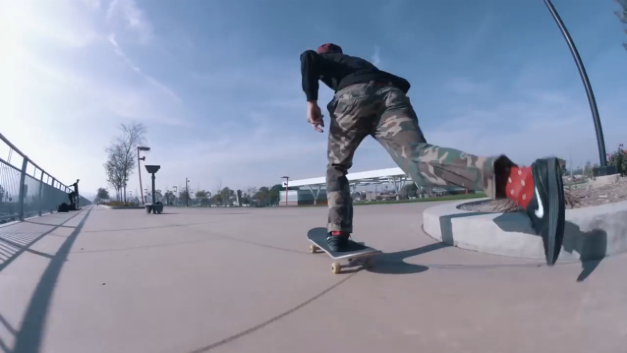
I went about creating my own animated overlays for the Trevor Colden skate vid - selecting a section from his Nike SB Chronicles part to keep it appropriate and relevant with the Nike brand.

- I added little details and streamlined effects over the movement of the skateboarder, with the aims of accentuating the speed and body movements he was carrying out to perform the tricks.
- But the main objective of the animation overlays was to draw attention to the Janoskis on his feet and show their diversity over the years.
- This was achieved by drawing over each frame's Nike tick and giving it a multi-coloured effect as the video went on.
- This gave the video a distinctive quality which deliberately draws the audience to the product being celebrated..
- To stay in-line with my justifications of how the industry is turning towards the more sleek digital, yet glitchy design style - similar to that of Studio Blup, who have worked with Nike in the past - I tried to represent this whole style to stay to engaged with the audience through the social media campaign ads..
- This was exaggerated through the use of a glitchy roll-over I made of the Janoskis - to fit on the celebratory poster/slide:

- Also making use of a little spinning Nike glitch logo that Blup gave me whilst I was on placement there:

- I culminated all of my research, ideas and animations together so far, to create the celebratory poster / slide ready for use as a mini campaign ad on Nike's social medias - aiming to effectively engage the audience through the trendy and current design style.
- I made use of the typeface Space Mono to stay consistent with this glitchy and digitalised style, whilst at the same time referencing the brands diverse and influential past through the retro-digital typeface as well as the more analogue processes referenced too - such as the inspired stop-motion on the animation and the polaroid inspired tag that the Glitched Janoski's sit upon...
FINAL RESEARCH PROJECT

Feedback:
- Good flow
- Short and punchy
- Perfectly appropriate for social media, being hard-hitting and to the point
- relevant to the current digitalised design styles we are seeing hit the market today (as my research references)
- music and style reflects the young and urban target audience
- considered layout and composition, prioritising content effectively through directing your eye round each element of the design piece by piece
603 - Brief 07 - The Idea & Considerations
To summarise my research nicely and really reflect this digital drive within the skateboard culture / industry, I considered the various outputs I could create:
- An animated poster - ideal for social media campaigns, on-screen viewing and ads, digital billboards, etc
- A video campaign / trailer celebrating the history of Nike - more time consuming for me and the audience - want something quick and punchy.
It was easy to decide some sort of animated poster would be most appropriate regarding my time constraints, but also for reasons such as the fact a social campaign needs to be quick, informative and punchy to keep the audience excited and engaged.
The content:
 - Celebrating Nike SB's Sweet 16th Birthday with the iconic Zoom Janoski Shoe
- Take some video footage of one of my favourite current skaters - Trevor Colden who rocks the Janoski's - footage from his Nike SB Chronicles 3 part - so very relevant and appropriate.
- Was especially intrigued by the last 30 seconds of the video part where they go and show how skaters aren't an entirely anti-social community - they go back to a spot where they'd had complaints and fixed it up and repainted it showing how they give back too!
- In the end I decided against these various slow-mo clips from the video as it was too long for a punchy ad. It was essential I considered how the song on the video couldn't be chopped up because I still needed the underlying sounds of the skateboard to add effect to my animation.
 Wanted to ensure I was getting nice shots like this to re-create - but wanted to to sit the Nike products at the forefront..
 These next 3 images show how I considered a section of the video with quite scenic shots, it felt very fitting for an advert but again I was too concerned that it wasn't going to be punchy enough for a quick animated poster for socials.


 This clip was filmed at the perfect angle which would really allow me to accentuate the bold Nikey tick contrasted by the original black and white Janoskis.
_________________________________________________________________________
 I began to look to the design industry and consider what styles I am most inspired by and feel would fit this project best - in terms of a punchy, on-screen experience which allows you to reflect on the history of Nike, whilst seeing where it is driving itself for the future.
Studio Blup has been a huge influence on my practise this year, allowing me to see how reasonably simple, progressive glitchy animations can bring a campaign to life and really enhance the message and content on offer in this current and futuristic remixed style - as the culture we now live in is one big remix of past inspirations and new ideas.


Their works with Adidas and Nike show how moving content can bring a shoe campaign to life.
Feeling very modern and current - appropriate for Nikes ever-evolving identity and broad trendy audience.
Considering what competition is out there is vital when it comes to designing as you want to constantly build on what is already out there and offer something new and unique, yet relevant.
A recent campaign by Adidas Skateboarding (obvious rivals) reminded me of a few animators I admire on Instagram who mask these layered doodles and animations over the top of skate videos - but taking it to the next level. This is how I could push the ad digitally but consistent with my style of work, taking a concept and putting my own spin on it through illustration and animation.


- Diesel Raptor
More vectorised and considered, yet still rough and doodle-y frame by frame animation - however directly masks on-top so it becomes the contrast within the video environment.
- Jack Hyde
Next level stop motion sketches of skate bits - especially love the behaviour of the lines transitioning into the movement.
- An animated poster - ideal for social media campaigns, on-screen viewing and ads, digital billboards, etc
- A video campaign / trailer celebrating the history of Nike - more time consuming for me and the audience - want something quick and punchy.
It was easy to decide some sort of animated poster would be most appropriate regarding my time constraints, but also for reasons such as the fact a social campaign needs to be quick, informative and punchy to keep the audience excited and engaged.
The content:
 - Celebrating Nike SB's Sweet 16th Birthday with the iconic Zoom Janoski Shoe
- Take some video footage of one of my favourite current skaters - Trevor Colden who rocks the Janoski's - footage from his Nike SB Chronicles 3 part - so very relevant and appropriate.
- Was especially intrigued by the last 30 seconds of the video part where they go and show how skaters aren't an entirely anti-social community - they go back to a spot where they'd had complaints and fixed it up and repainted it showing how they give back too!
- In the end I decided against these various slow-mo clips from the video as it was too long for a punchy ad. It was essential I considered how the song on the video couldn't be chopped up because I still needed the underlying sounds of the skateboard to add effect to my animation.


_________________________________________________________________________
I began to look to the design industry and consider what styles I am most inspired by and feel would fit this project best - in terms of a punchy, on-screen experience which allows you to reflect on the history of Nike, whilst seeing where it is driving itself for the future.Studio Blup has been a huge influence on my practise this year, allowing me to see how reasonably simple, progressive glitchy animations can bring a campaign to life and really enhance the message and content on offer in this current and futuristic remixed style - as the culture we now live in is one big remix of past inspirations and new ideas.
Their works with Adidas and Nike show how moving content can bring a shoe campaign to life.
Feeling very modern and current - appropriate for Nikes ever-evolving identity and broad trendy audience.
Considering what competition is out there is vital when it comes to designing as you want to constantly build on what is already out there and offer something new and unique, yet relevant.
A recent campaign by Adidas Skateboarding (obvious rivals) reminded me of a few animators I admire on Instagram who mask these layered doodles and animations over the top of skate videos - but taking it to the next level. This is how I could push the ad digitally but consistent with my style of work, taking a concept and putting my own spin on it through illustration and animation.


Insta Animators:
- Mikey Glover
creates doodle line drawings of skate vids - created frame by frame he recreates the entire scene
- Diesel Raptor
More vectorised and considered, yet still rough and doodle-y frame by frame animation - however directly masks on-top so it becomes the contrast within the video environment.
- Jack Hyde
Next level stop motion sketches of skate bits - especially love the behaviour of the lines transitioning into the movement.
603 - Brief 07 - Conclusion of Research / The Brief
My research to this point has provided me with great detail regarding how the skateboard culture originated, began to grow, failed, but then started back up again and expanded from there.
It has made me consider how it was more of a niche, frowned upon hobby and still is within society now - the only real difference being now is it has a multi-billion dollar on-screen industry supporting it! But this proved to me the basis of the community, looking at how social media will continue to provide us with this immediate contact, 24/7 content and interactive way to communicate with vast audiences directly and the role-models can talk back.
This has allowed for skaters to create their own brands for themselves online - still complying with the cultures big and influential brand names but taking this past them and a step further with round-the-clock video content for kids to get hyped over with their friends. It has created new means of engagement and advertising possibilities which have inflated the industry even further.
Big brands and influencers have obviously pushed use of this platform as the most efficient way of directly engaging their fans, and it is clear how brands like Nike have evolved with this to remain as one of the largest brands on the planet.
Brief -
Using my research to this point I aim to celebrate the history of Nike Skateboarding whilst continuing to push them into this new realm and style of trendy digital advertising.
Background -
I need to consider all research conducted to this point on Nike SB as a brand and its developing approach to its advertising campaigns, whilst also considering how I can carry this forward and create something new and engaging for the community - inspired by the new glitchy / remixed styles of today, as well as still reflecting on its diverse past.
Target audience -
The current youth of the Skateboarding community, and creatives in general.
Mandatory requirements -
An interactive output - such as a poster, which will blow up and engage audiences through the digital and social realms.
603 - Brief 07 - Janoski
Stefan Janoski is one of the most recognisable names in all of Nike SB footwear -

I found an interesting podcast interview with him where he talks about the origination of his iconic signature and how he just wanted to make a shoe in his own vision, which would perfectly fit his requirements as a skater. This then taking off and then evolving into all the different variations of the shoe too - Lunarlon, Hyperfeel, Max, etc.
He discusses how he first signed with Nike and why he prefers function over protection. Stating in the interview that he hopes the first Nike SB Stefan Janoski will live forever, the legendary skater breaks down the entire design and what makes it so special.
https://soundcloud.com/thebuntlive/the-bunt-s03-episode-9-ft-stefan-janoski-actually-it-was-pcp-not-crack
603 - Brief 07 - Nike Today
Just by looking at current Nike SB campaigns now, you can see how the industry and culture have grown so much - especially now with the development of the digital platform and developed graphic design styles which are so readily available to us through any social screen we may come into contact with.
Take their Lunar One Shot Campaign campaign for example..
Nike can now go as far as getting custom skate obstacles built to help carry out their vision in ads - creating skate features that mimic their new Lunar One Shot skate shoe. The modern art-esque skate features they created for the commercial are innovative and progressive just like the design of the Lunar One Shot.
Also commissioning various big name designers to get involved asking them to create a product page that could easier be updated each month to keep online and social content regular and in-sync - this building hype for the drop of each new colour-way.
Take their Lunar One Shot Campaign campaign for example..
Nike can now go as far as getting custom skate obstacles built to help carry out their vision in ads - creating skate features that mimic their new Lunar One Shot skate shoe. The modern art-esque skate features they created for the commercial are innovative and progressive just like the design of the Lunar One Shot.
Combining video and action photography, they provide editorial inspired layouts with rich content.
With this developing style within the industry you can see how everything from the coverage and content, to the level of production has drastically improved and evolved with the digital design style...


Subscribe to:
Comments (Atom)