
There was only Anna's "I am still professional" one to animate and then we had the idea for one of Jen's type responses "No Time for Hate" - to animate in spinning hands on the clock (partnered with tick-tock audio) which took some time to edit:


The next step for me was to gather all of the compositions/animations and experiment with how they would fit onto the body parts and look natural.
This was achieved through some warping were necessary (dependant on the angle of the body part) and then lowering the opacity very slightly in conjunction with an altered blending mode - either Overlay, Darken or Multiply dependant on if the tattoo design had a white background which needed to be made skin colour, or if it was just solid black which needed to allow the texture of the skin through.
Here is an example on Tomi (you can see the shiny pores on his skin through the tattoo as you would naturally):

One of my first experiments of mocking up my own Old American style designs proved a pivotal first example for us; where we could make some serious decisions as a group as to how we were going to keep the videos consistent with one another...


As you can see from the storyboard, I was experimenting with how I could partner the animations with real tattoos on the wearers body.
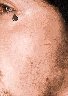
First of all we decided to set a rule against this as it did reduce the realism of our designed tattoos that we were adding to the skin.
So this was a no-go, resulting in me using a different image for the swallow to fly across - in the crit we agreed the inner bicep seemed the most appropriate, as it could fly out from around the other side of his arm.
This was also the first trial of using the same still images that will be used in the posters as the videos.
We decided to consistently start from a zoomed in point of the image, allowing the tattoo to be viewed up-close and in detail, and then pan away and out from it to give a wider view of where on the body it is positioned. After some trial and error, we showcased these to a group of 10-15 people in the studio, and everyone could agree it appeared much more professional and actually felt like a real panning video with the moving tattoos being the main attention grabber.
The final decision, was to make all of the compositions black and white. This ensured a consistency of tones throughout all of them, and helped the tattoos projected onto the skin to feel more realistic. As I will briefly discuss in Robs poster designs, we did agree to go with a desaturated B&W theme all the way through the campaign, emphasising the contrast in the photos, aswell as giving the campaign on a whole a very bold appearance -reflecting the stark black inks used in the tattoo industry.
Here are the individual animations, converted into gifs for blogger:

Design by Jen
As shown before I animated the clock hands, and applied transitioning animations the text.
Uses Monotype typeface Fraktur.
Biggie smalls lyrics below to relate a humorous tone of voice, offsetting the gothic typeface. This also links to the hip hop scene and related sub cultures, opening the possible appeal of the design. I opted for a gothic 'Sons of Anarchy' aesthetic of design, often seen in modern culture so not as menacing anymore.


 Design by Rob


 Design by Rob
I transitioned in the triangle design along with the Monotype text to follow in once positioned.
More of a conceptual piece for the creative character, aims to question how tattoos could not be seen as being 'artwork' for the skin.
Design by Rob
Transitioning animation by me.
One of the bolder and charismatic Monotype typefaces from Dan Rhatigans collection. Encouraging tattoos as a form of expression. On Tomi the creative
Design by Jen
Heart beat animation by me
The gothic typeface appeals well alongside the stark, almost gruesome tattoo of a beating heart. Reflects ideals of no judgement because of ones tattoos.
Design and animation by me
Eliciting how we have evolved past prison tattoos and the negative connotations, tattooing is an artform and way of expression.
Design by Jen
Transitioning animations by me
Reflecting someone free to express themselves with their tattoos
Design by Anna
Animation by me
Reflecting the modern day professional.


To collate all of the animations, I created a showreel of all them.
This featured our bold lettering as used in the posters (will justify in next post) with our introductory text to the campaign - 'Promoting expression of tattoos in everyday life' which is used throughout all of our deliverables. At the end of the video you see our interactive hashtag appear 'BeYouInYourSkin'.
A finalising decision was made as a group, that some of SFX should be turned down and then I had the idea of introducing the instrumental version of 'Express Yourself' by NWA with just the chorus line powering through supporting the whole concept behind the campaign. We had to be sure it did not infringe any copyright restrictions, and also obviously to use the instrumental version with no lyrics to avoid explicit material.
In terms of distribution, this long digital ad is about a minute long, so this version will be available on the online campaign/social media/etc. If it were to be featured on TV, or interactive signs on the side of buses/bus stops/buildings/etc it would be narrowed down to just one of the animations randomly shown, with the intro text and concluding text showing before and after, constantly looping through all of them, but ensuring the text provides the context of the campaign between each one for quick interaction of passers by.

No comments:
Post a Comment