

Sacred Geometry - I identified sacred geometry as maybe being a device I can play with which reflects this concept of connectedness with all at LCA.
Sacred in 'Sacred Geometry', does not imply Holy, but rather pertains to certain truths, of a mathematical and geometric construct that are rooted in deep meaning.
The fixed laws of nature and physics can be illustrated to relate to the passage of those who wish to journey into source, through the mapping of geometry, representing a deep connection with all that is, thus enabling the potential for every individual to recognise their own capacity to communicate with creation.
It is our own sacred connection with creation, eternity and the totality of the great ecosystems, inner and outer, and thus a portal to, and reflection of our Innerverse.
- Feedback from a crit group suggested how I need to be careful with experimenting with this as it is very conceptual and can often be confused with icons of Buddhism from first glance - although I want to infer diverse culture at LCA, I do not want to favour one religion or suggest we are honed to just one.
I explored how the mosaic idea could be pushed and reinvented with a modern approach to push the justifications for the colleges visual identity.
I started looking at examples of how I could combine imagery overlaid with hundreds of images of LCA's finest faces.
- I would photograph as large and diverse of a sample that possible
- Could also combine this with examples of works from the students too
- Try that separately aswell
I started looking at examples of how I could combine imagery overlaid with hundreds of images of LCA's finest faces.
- I would photograph as large and diverse of a sample that possible
- Could also combine this with examples of works from the students too
- Try that separately aswell


- Words for DNA response
"build on your creative/molecular structure"
Represents how this can be appropriate for an editorial cover layout, therefore will work and adapt to poster banners too.
But I can experiment with what fills the rest, incorporate patterns? negative space? etc
Artistic examples of how people have already experimented with some imagery of eyes and DNA already.
- What makes them unique is what the concept behind the smaller images/components making up the image.
Ideas for wording to go with Eyes - "Up North, we've got an eye for it" or "come experience the creative world from our perspective"

Can also experiment with adjusting colours to elicit stronger feelings in different ways, make it more appealing.

- Wires / Soldering / Power tool - show off facilities somehow
"re-wired ready industry"
"re-wired ready industry"

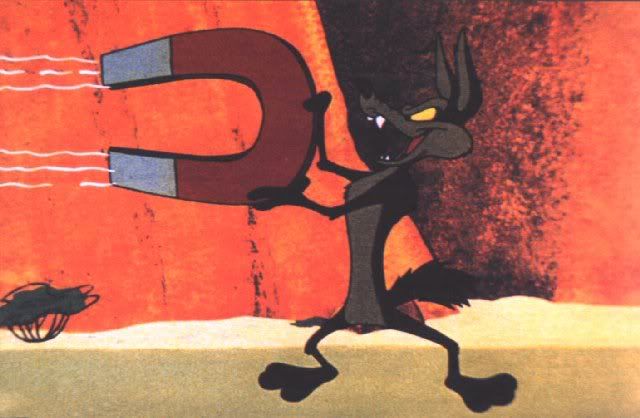
- Magnets - represent with an illustration students work?!
"attract the placement thats right for you",
"attract the placement thats right for you",
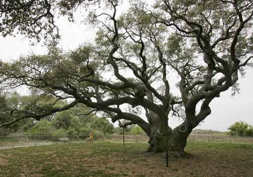
- Trees
"branching out into industry" "come and strengthen your roots" (routes!?)
Specifically look into how I can use different tones of voice; in particular into how the more popular unis approach it to attract their students
- Also look at popular culture and things art students in particular are attracted to.
I remember seeing the De Montfort Uni advert before coming to LCA. LCA was always my first choice but DMU was my backup as I was very inspired and attracted to go look at the uni after seeing the video.
- The clean visuals partnered with the strong tone of voice were what I found so bold so I want to use a similar but maybe slightly more witty/clever impact too.
The TV advert features students at its heart with a ‘daring’ new theme.
The concept of the advert is ‘Dare to Do’ and the stories in the advert are inspired by real examples of daring behaviour from DMU students.
Seven individual stories are followed in the advert. DMU students star in scenarios that have pushed them out of their comfort zones.
It features strong and inspiring words and the approach is very inspiring and attention grabbing.
"We are living in turbulent and testing times, the world is standing on a razors edge, we are own worst enemy if we walk the path thats worn thin, dare to find an alternative that makes our hearts beat that little bit harder, then together we will make great strides for the good of all, this is not about surrendering to convention, this is learning to succeed, this is De Montfort University, Leicester."
This years new advert for the uni lets the visuals do more of the talking, but it still finished with a bold ending - "Those who dare, do"
This years new advert for the uni lets the visuals do more of the talking, but it still finished with a bold ending - "Those who dare, do"
No comments:
Post a Comment