
Re-visiting the logotype to newly develop and justify it..
(Eurostile Bold Extended 2)

Before confirming Eurostile as the final typeface, I approached Ferguson with some similar options which are just as bold and industrial feeling, but maybe more charismatic in alternate ways:

:format(jpeg):mode_rgb():quality(90)/discogs-images/R-811808-1162082270.jpeg.jpg)
- Reminds me of the underground industry straight away through old artwork for DJ Skream.
- doesn't feel very unique or fresh
- "I've seen it too many times before"

Feedback:
- too plain, not expressive and rigid enough for the underground scene.

- Slightly more rigid and impactful when in full caps.
- very legible
Feedback:
- "doesn't feel at all linked with my tractor background"
It was clear how he was not set on swaying from the typeface, which in fairness will keep his identity consistent with the platform he has already started to build, yet I will hopefully be able to evolve him into something more considered and fresh for the industry.
- he is very pleased with Eurostile's industrial nature, obviously reflecting his proud Yorkshire-man roots playing on the farm. This is a solid typeface for what we are using it for - an impactful logotype...


Both me and Ferguson were happy to continue carrying forward the use of Eurostile and the applications / justifications it carries being quite a techy, impactful industrial typeface - I feel it reflects and fits within the grungy underground industry perfectly, also having connotations linking it back to brash 90s type and his loud, hard-hitting personality.

- I made it grey and added an inner glow to begin achieving that inward facing gradient inside each letterform.


Took this even further, with a scanned-in overly grainy inspired option:


Feedback from Ferguson:
- "The new hand-rendered/letter-press inspired aesthetic to the logotype feels more in-sync with me as a creative in general - I fully agree with the justifications you have provided being relevant to the grungy underground rave scene as well as the imperfections and grain inspired from my film photography. However I do think the last 2 options take it too far, they create almost too much contrast and exaggerate the concept too much so it loses its effectiveness - it is not really necessary for it to still be impactful. For that reason, I am going to go for the top two."
- I was happy he was able to make a solid connection with how I had finalised the design for him; I then went on to suggesting how I could experiment with taking these justifications a step further by considering how the trend of warped text could be impactful to try and incorporate references to his quick style of DJing - fast paced through his chops and screws from channel to channel.
I showed various examples (below) but we made the joint executive decision that it does not need to be over-complicated any further - this is impactful enough and anything else can be experimented on in the future, for various digital outputs on posters/flyers, etc.


I began considering how I can now enhance this grungy, grainy feel which not only comes with the underground dance industry but comes with his whole aesthetic portrayed through his photography too - feeling very imperfect and hands-on like the unique analogue process of film photography.
- This will then effectively reference his influences from the past but also effectively drive him into the clean and concise digital realm too.
- This will then effectively reference his influences from the past but also effectively drive him into the clean and concise digital realm too.
This experiment was done through attempting to create Letterpress inspired effects on the letterforms - as if it has been pressed/stamped down with cracks in the ink, etc...
On Illustrator I used..
- the Roughen tool to add some texture to the straight-edges.

- I made it grey and added an inner glow to begin achieving that inward facing gradient inside each letterform.


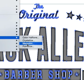
- Used the Mezzotint filter (on grainy dots) to now achieve this rough texture within.

- Now by adding the filter 'Stamp' it blends the individual grains together to create a more considered textured effect anchored towards the centre of the letter-form like where the ink wouldn't have reached on the stamp/press.

Applied this process to the logotype to achieve this more distressed look, to stay in-line with this grungy aesthetic influenced by the visuals associated with the underground industry and more vintage-style film photography.


Took this even further, with a scanned-in overly grainy inspired option:


Feedback from Ferguson:
- "The new hand-rendered/letter-press inspired aesthetic to the logotype feels more in-sync with me as a creative in general - I fully agree with the justifications you have provided being relevant to the grungy underground rave scene as well as the imperfections and grain inspired from my film photography. However I do think the last 2 options take it too far, they create almost too much contrast and exaggerate the concept too much so it loses its effectiveness - it is not really necessary for it to still be impactful. For that reason, I am going to go for the top two."
- I was happy he was able to make a solid connection with how I had finalised the design for him; I then went on to suggesting how I could experiment with taking these justifications a step further by considering how the trend of warped text could be impactful to try and incorporate references to his quick style of DJing - fast paced through his chops and screws from channel to channel.
I showed various examples (below) but we made the joint executive decision that it does not need to be over-complicated any further - this is impactful enough and anything else can be experimented on in the future, for various digital outputs on posters/flyers, etc.


No comments:
Post a Comment