
The Design Kids


 .
.They approach their visual identity in a very simplistic but hard-hitting way.
- Making use of a punchy and expressive word-mark, which is either used alone in vibrant and playful colours, or a more enclosed symbol version.
Still feeling thoroughly inspired by Frankie's talk from when she came in, I got in touch with her regarding our travel idea, to see if she had any opinions, I am still awaiting a response however though..

The Pop Up Agency


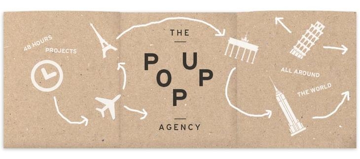
The Pop up agency have a very distinctive USP which entices brands around the globe.
Their basic identity is charismatic and hard-hitting and fits into a variety of formats which reflect their process and lifestyle.
Highlighting their pop-up, traveller nature.
Do I want to directly take inspiration visually from these brands, or create something entirely different and eye catching?
No comments:
Post a Comment