
My next step was to begin experimenting on Illustrator developing on from sketches and looking at how it could actually fit together and work..
 Taking direct inspiration from the lightboxes I looked at how I could develop a similar styled pattern into something new but still recognisable.
This was unsuccessful so I went back to my sketches and developed a simpler linear response.
I experimented with how the lines could be more frequent and also how it could develop into an actual border for the poster..

I decided to leave that one and focus on one of the more adaptable patterns. This one would have to be used as more of a background/border, as it is too busy to try and overlay text straight onto it, with the risk of it become to overcomplicated and swaying from the minimal design style.
Like in my last few sketches I trialled this idea of a border and then added in the straight-forward content into the centre.
I wanted to create a hierarchy of information with the type weight and size. The strong heading entitles "Leeds' Ultimate Multi-Use Events Space" then beneath with all the various facilities that Headrow offers reeled off as an impressive long list - it immediately identifies how this is a venue for the whole family - restaurant for everyone, beer hall for Dad, Cocktail Bar for Mum, Events space and outdoor areas for the young adults/teens.
I want the surrounding graphics and colour scheme to be immediately recognisable to Headrow, so when people first interact with this initial bold statement it intrigues them so they read on - this will allow for an element of UX to come in when they first visit Headrow, as they will be able to make the link upon viewing the lightboxes in the stairwells! If they already have visited Headrow then hopefully they can immediately make that link themselves and realise before interacting with the rest of the poster, its aim is to celebrate and advertise Headrow House.

Before exploring layout any further I wanted to address how I was to justify my type decisions. I looked into various routes I could take from variously styled sans-serif typefaces, even trialling a fancy serif typeface..

Myanmar reminded me more of a skin-care brand, with its quite wide form and various line weights. I wanted something bolder to make the headings stand out, and thought about how my process could influence the type. With the imperfections of screenprinted, I trialled a more hand-rendered feeling typeface - it definitely felt bolder however its form didn't feel sharp enough for headings, and especially wasn't appropriate to represent Headrow - was almost too childish.
Considering a more sophisticated approach like the branding of the cocktail bar I trialled a serif typeface - strong contrasting line-weights and sharp serifs gives off a very sleek look. But in order to represent this modern identity I definitely wanted something more universal, and overall bolder in form.
I trialled the classic sans-serif typeface Akzidenz Grotesk, which with its various weights and styles did pose a possible contender. It feels very strong and its consistent form fits the style of Headrow - however I was sure I could find a sans serif typeface which was both highly legible and recognised like Akzidenz but gave a bit more character..

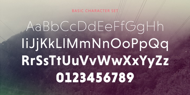
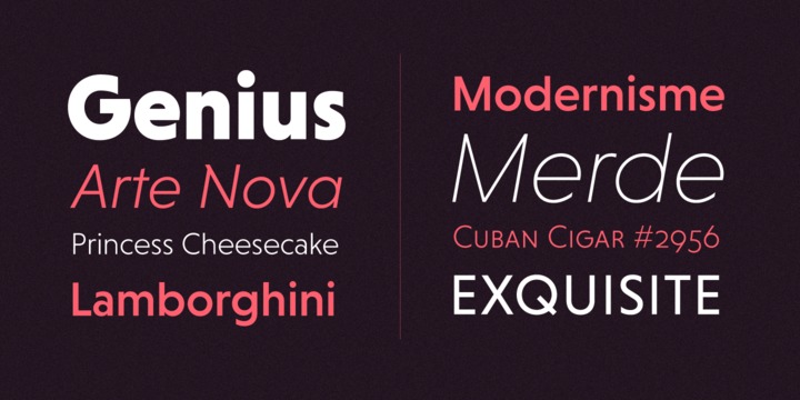
It was designed by Hannes von Döhren in 2013.
Influenced by classical nineteenth-century faces, the fonts are based on geometric forms, the N being an example of its more charismatic feel than plain Akzidenz.
Because of its straight architecture, Niveau Grotesk has a “punch” in big sizes but is very legible in smaller sizes and longer texts—in print or on screen.
I applied my chosen typeface and began trialling my halftone experiments, looking at how the images could be in partnership with the type giving the only other clue as to who the poster is celebrating.

Initially I didn't like how it fitted into the space, as the darkness took away from the content too much. I asked some coursemates for feedback regarding this and they confirmed my route consistent with the responses from previous crits of encouraging me to address it in a much simpler, obvious way so the audience don't have to pay close attention to the image to know who the poster is celebrating.
This can be done by simply using the logo as experimented with in my sketches, not to mention this will allow me to see how the logo may inspire my type alignment experimentation...
Should I use lines to break up the information? No, it just overcomplicates it, need to scale the content down a bit too to enhance the negative space and guide your eye more comfortably.

 I knew I didn't want to stray away from the orange, black and white; but I tried to think about I could variate the colour scheme slightly for more impact.
I tried a full orange background for the text box, but it was clear to me how this didn't allow for the border to have as much impact, then directly affecting the strength of the centre text too - as the white didn't provide enough contrast, even with a black outline.
Next I did want to play with the layout and actual alignment of the text, in response to the centred justified alignment present in the logo and on the website.
I decided to re-evaluate how the hierarchy of information would work, testing with random volunteers in the Cafe what order they viewed the information in initially and which part they were most drawn to. This would help me develop the most effective ordering of the content, allowing the eye to be naturally guided through the hierarchy of information.
I showed them the version of the poster above (but in the normal colour layout - white background).
Every test subject confirmed to me how the bold type is what you are initially drawn to, whilst simultaneously recognising the colour scheme of Headrow (70% could recognise but the other 30% had never even been!)
Next they looked at the logo to confirm to themselves (or find out) that this was for Headrow and then they read the facility information.
This suggests to me how the main type would be most effectively viewed if it was at the top, and everyone agreed that the order should run systematically down, with
- "Leeds' Ultimate Mutli-Use Event Space"
- Facilities list
- the logo - to confirm to the audience who it aims to celebrate.
I trialled these ideas in the posters and also thought about how the scale of the logo would effect the arrangement.

Although my last experimentation above does sit the large logo at the top, this confirmed to me how it needed to be the other way round - small and at the bottom!
The logo inspired me to trial the central type alignment and this actually applied very nicely to the layout.
 As my research supports, I ordered the content and then adjusted the type to central. The content flows much more fluidly now and the smaller sized logo confirms to the viewer but doesn't draw away from the information too much - allowing the viewer to naturally work their way down the page.
To finalise and actually test the poster through its process of screenprinting. I separated the coloured layers into separate artboards and then went about the exposure process ready to print!

No comments:
Post a Comment