
- The crime scene images of the bloody footprint

- The family home itself is a recognisable feature of the case study


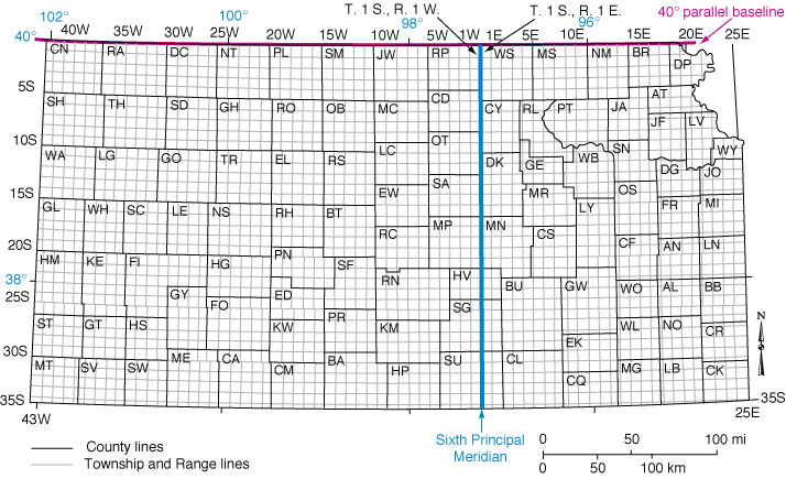
- The actual location - Holocomb, Kansas, Texas - on the map shows the bizarre crop circles, could be inspired by this or the old style grid maps of the local area..

- The fact the victims were all tied up


- The barrel of the shotgun?

With these key points to go off, I can start deciding how I can apply these into this illustrative style to start forming different cover ideas and then how it can work alongside a large title, etc. The examples below highlight this in action on magazine spreads and graphical covers similar to what I am aiming for..
Reflects how this trend of how a vectorised light source can be used to define the outline of the detailed focus point of the illustration, leaving space for the type around it.


Another one of my favourite illustrators is Thomas Danthony, he is a french artist based in London. Often narrative, his work is characterised by this clever use of light, bold compositions and a dose of mystery...


From these inspirational works I've started building a canvas of colour palettes that can be applied to my start-up illustrations, which I can develop with me as I grow..

No comments:
Post a Comment